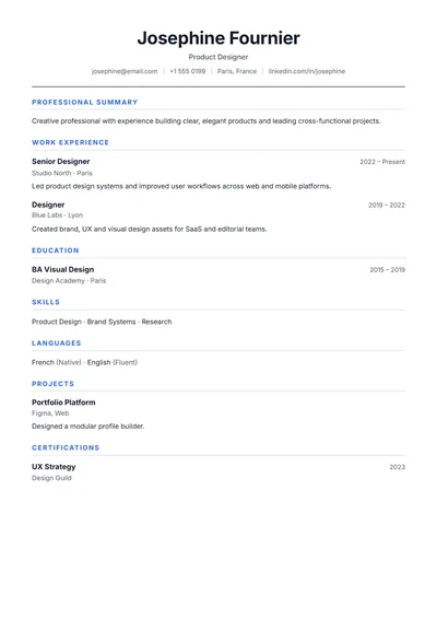
Simple
NewA genuinely simple resume: centred name, hairline rules, one column. Nothing to distract, nothing to break.
Use this templateTemplate guide
A type-only resume. A light, wide-set name, section labels in small capitals in the left margin, and plenty of white space. There are no lines, colours or icons, so it looks considered rather than plain.
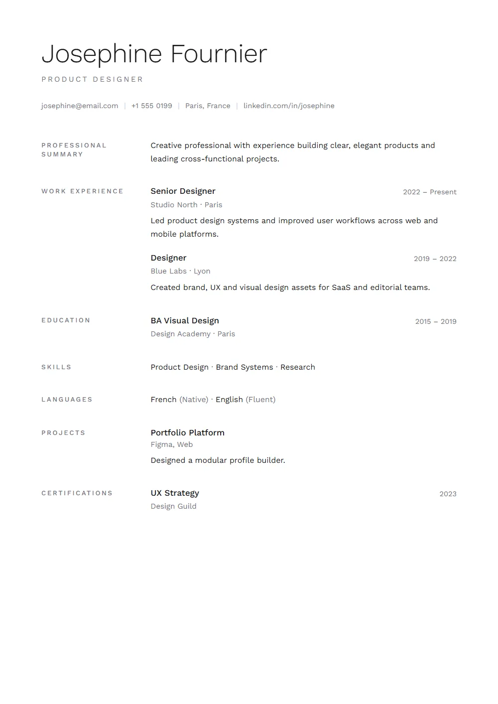
A minimalist resume removes decoration, not information. The space it saves goes to white space, which makes every line easier to read. It works best when your content is already strong: clear titles, specific results, short bullets.
Putting the section names in a left column creates a clean vertical line the eye can follow down the page, so the reader finds Experience or Education without hunting. The content column stays wide enough for full-length bullets.
Both are ATS-safe single-flow layouts. Simple has a centred name and ruled headings and feels conventional; Minimal has margin labels and light type and feels more designed. Try both in the editor; your content stays when you switch.
Three close alternatives, and every one carries your content across untouched when you switch.
A genuinely simple resume: centred name, hairline rules, one column. Nothing to distract, nothing to break.
Use this template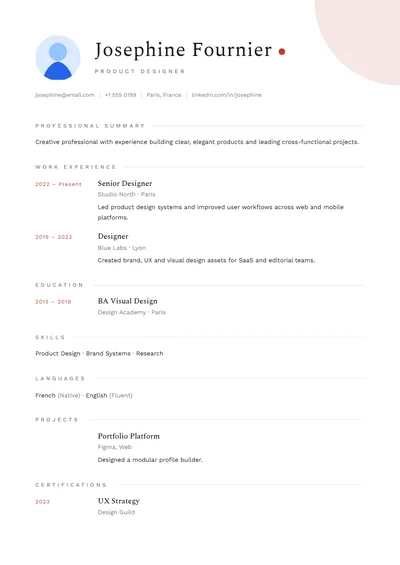
Japanese-minimal: one red sun, wide margins and quiet serif type. Calm and very senior.
Use this template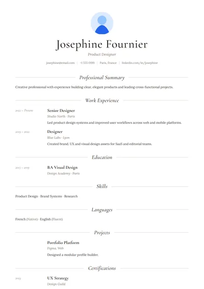
Thin serif headings with hairline rules — understated and refined.
Use this templateFAQ
A resume that uses typography and white space instead of colour, icons or graphics to organise information. It keeps all the content of a standard resume.
Usually more than any other style, because there are no graphics or text boxes. This template exports real text in reading order.
Not if the content is strong. The layout makes specific results easier to see; it only looks plain when the bullets are vague.
This template has no photo slot, by design. If you need a photo, Minimal Formal keeps the same restraint with an optional photo.