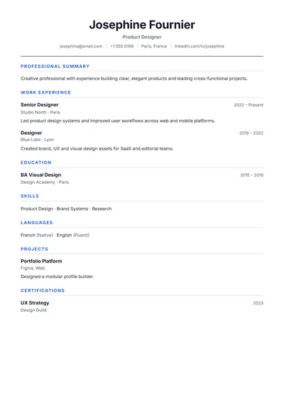
Simple
NewA genuinely simple resume: centred name, hairline rules, one column. Nothing to distract, nothing to break.
Use this templateTemplate guide
A high-density layout for people who need to fit a lot onto one page. Tighter spacing, a compact header and inline skills and languages, while keeping the type large enough to read comfortably and the structure ATS-friendly.
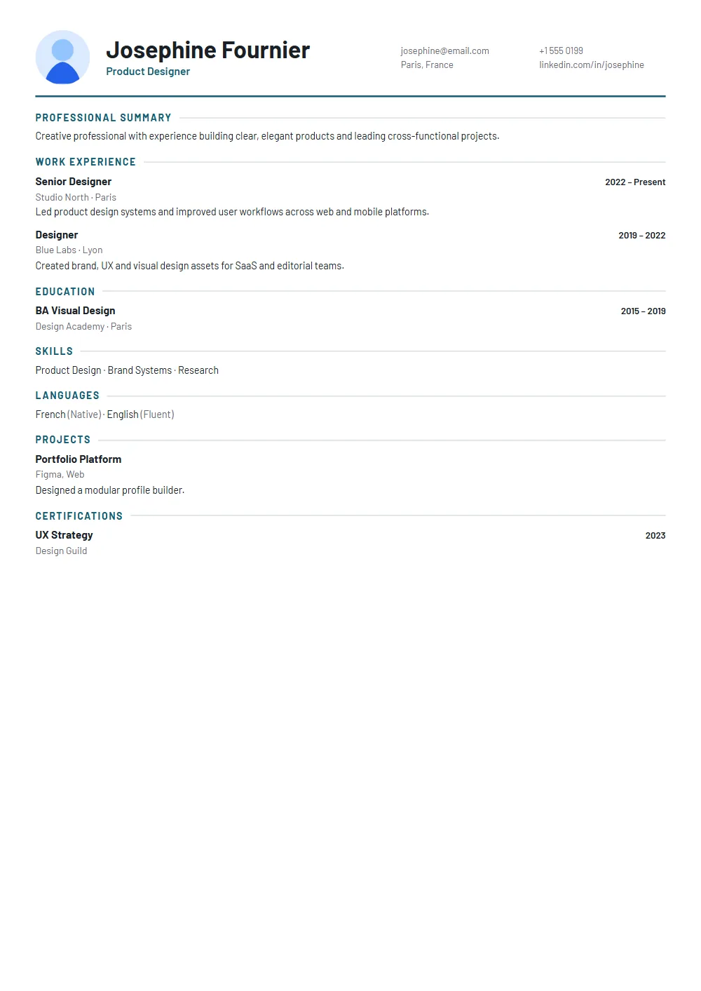
Many employers and programmes ask for a one-page resume: consulting firms, banks, graduate schemes, career fairs and most roles in the US for candidates with under ten years of experience. A compact layout gives you room without resorting to 8-point type.
The layout saves space; your editing should too.
The editor shows page breaks live. If your content spills to a second page, the preview shows it immediately; cut until it fits. If it still spills after honest editing, two pages are fine for most experienced candidates, and the Professional or Chronological templates use the space well.
Three close alternatives, and every one carries your content across untouched when you switch.
A genuinely simple resume: centred name, hairline rules, one column. Nothing to distract, nothing to break.
Use this template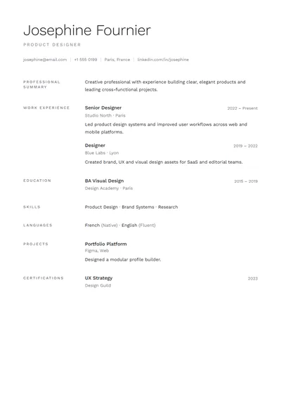
Type-only layout with generous whitespace and no decoration. Parses perfectly.
Use this template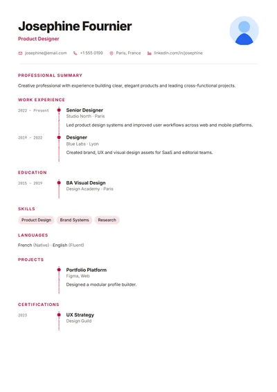
Reverse-chronological layout with a dotted connector on every entry.
Use this templateFAQ
Cut roles older than ten to fifteen years to one line, keep two to four bullets per job, write one-line bullets, and put skills and languages on a single line. A compact layout like this one helps.
Yes if you have under about ten years of experience or the employer asks for it. Senior candidates can usually use two pages.
No. It saves space through tighter spacing and inline lists, not tiny type, so it stays readable when printed.
Yes. It is a single column with standard headings and real, selectable text in the PDF.